Atomic Architecture for Physical Spaces, a Scalable Logic in Home Automation
Look Ma, I Built That
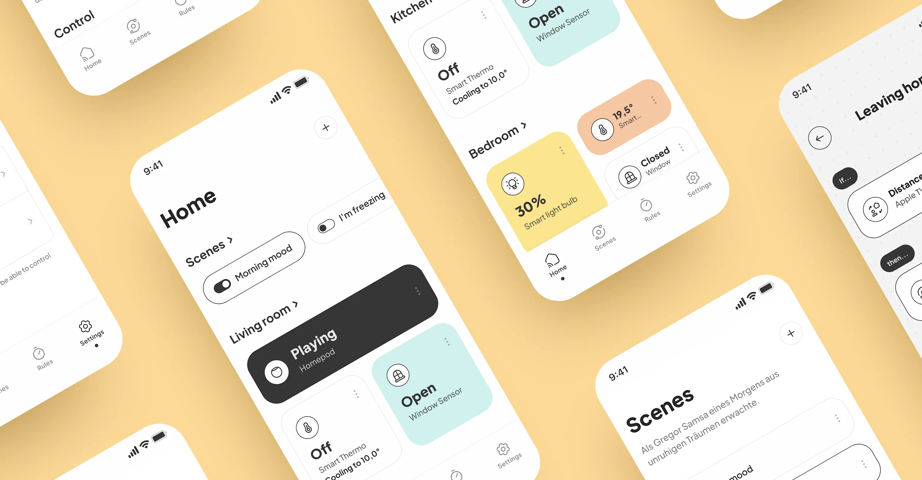
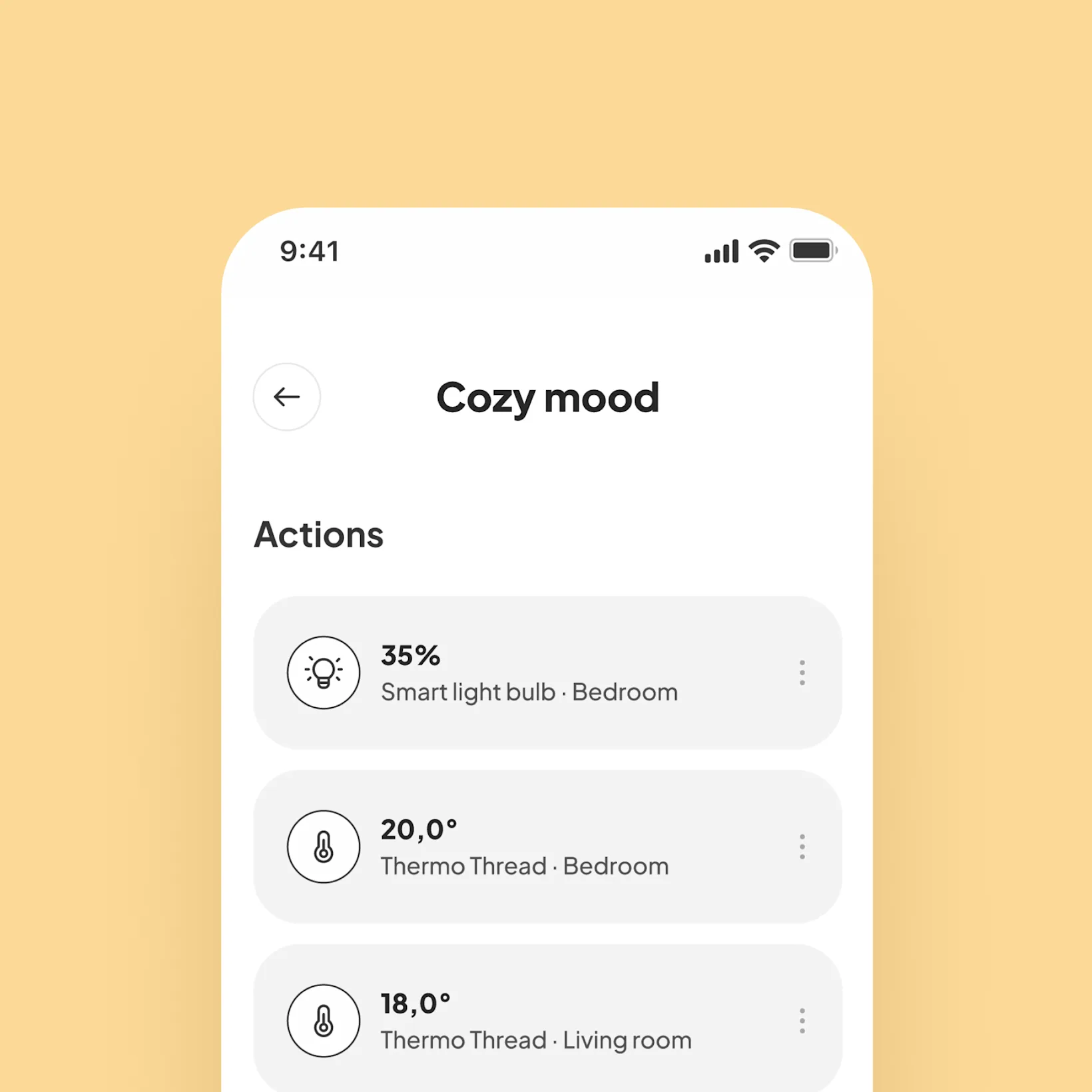
The Smart Home App reduces the cognitive load of home automation by stripping away trend-heavy effects for a high-contrast, flat-component ecosystem. It prioritizes a "one-thumb interaction" model, turning complex environmental adjustments into tactile, physics-based gestures. By focusing on accessibility and speed, the project proves that minimal UI can manage high-utility physical spaces without overwhelming the user.
The Nightly Haunted Vision
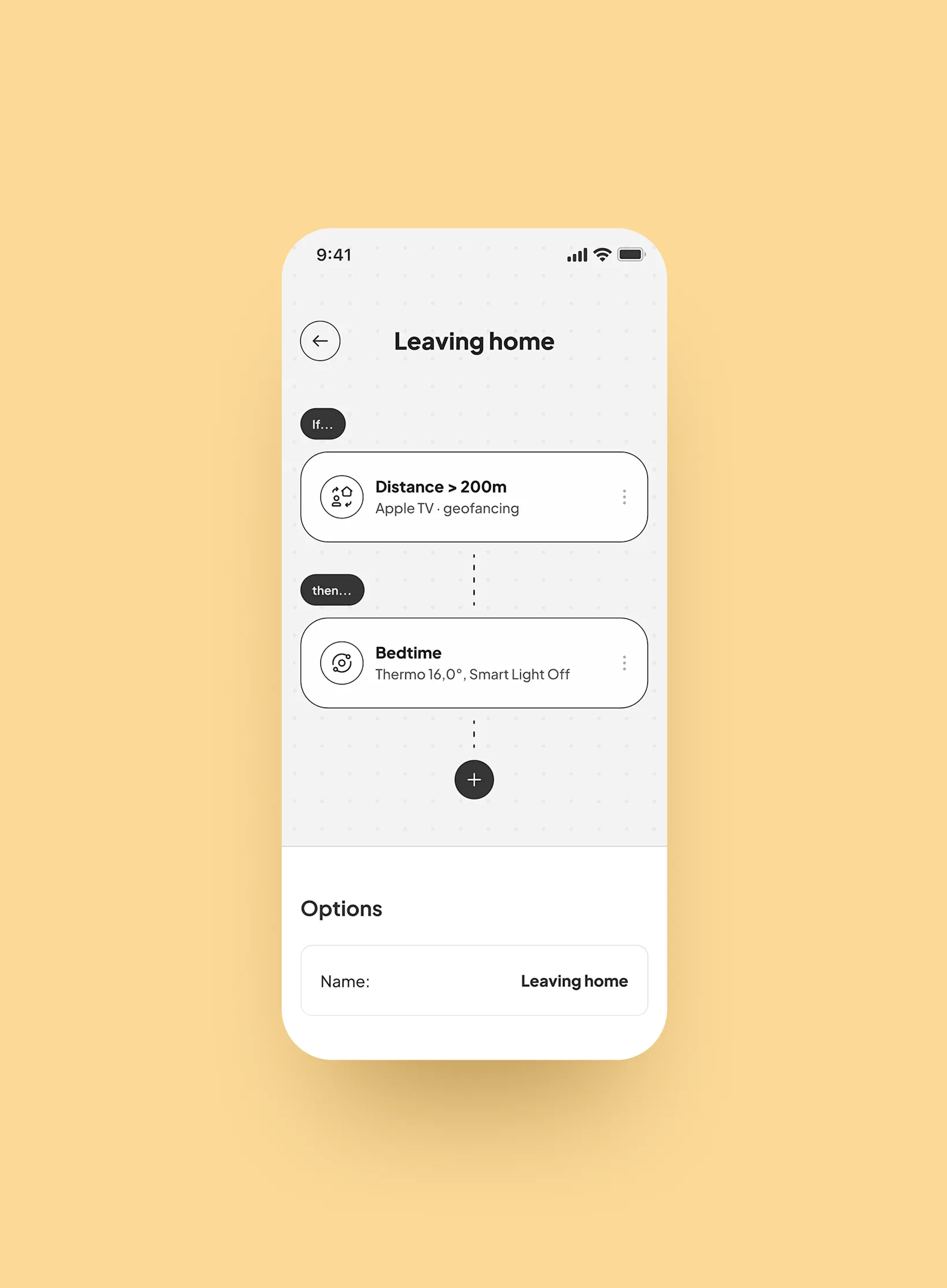
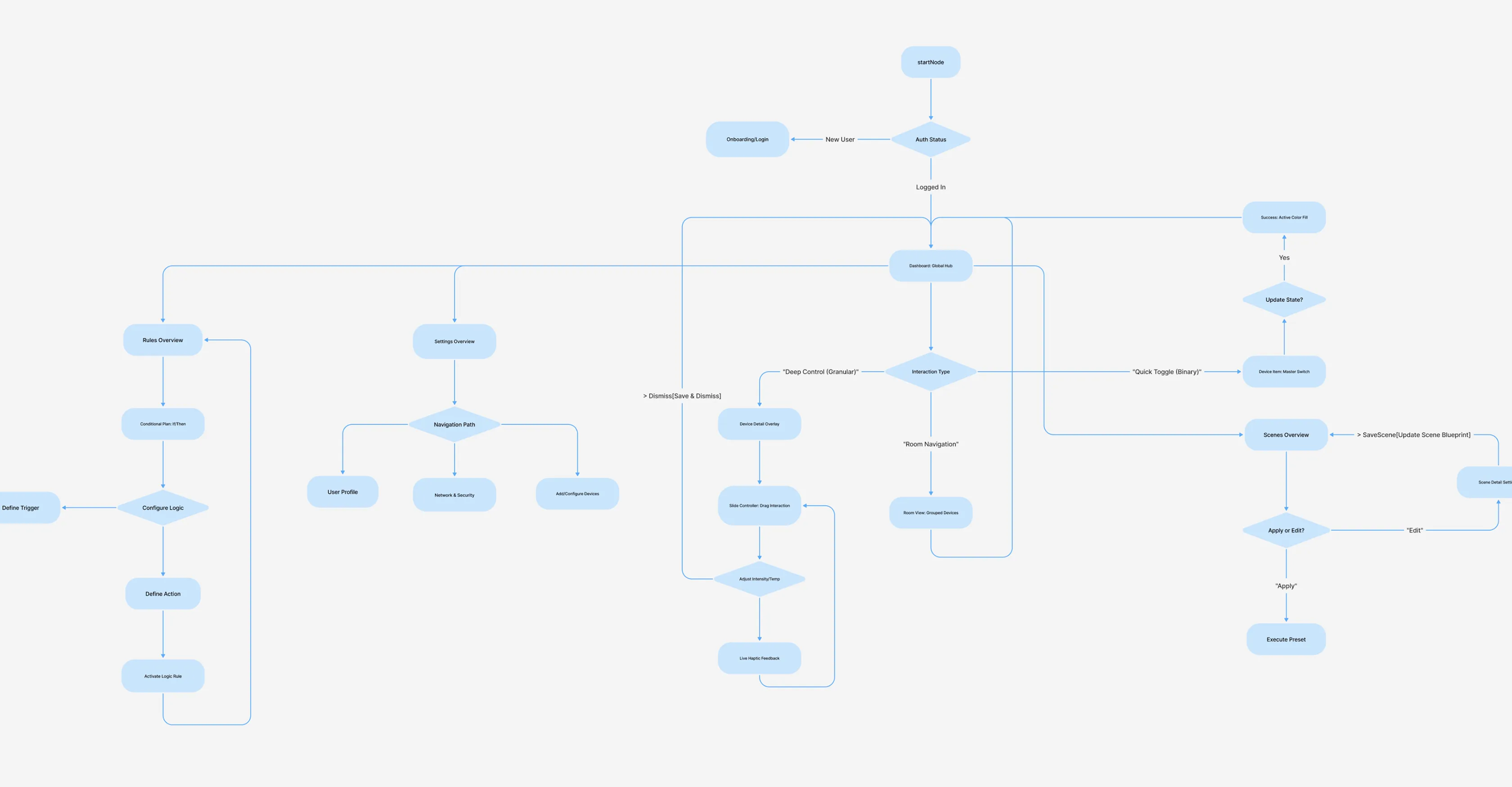
Smart home interfaces often resemble 90s cockpit dashboards. The impulse for this project was the "Deep Menu Trap,"where simple tasks like dimming a light require excessive navigation. I tested the hypothesis that a flat, modular "Bento" architecture—combined with multi-state interactive prototyping—can eliminate navigation depth and make the UI an invisible extension of the user’s hand, prioritizing utility over visual clutter.
Nah, Let’s Fix That
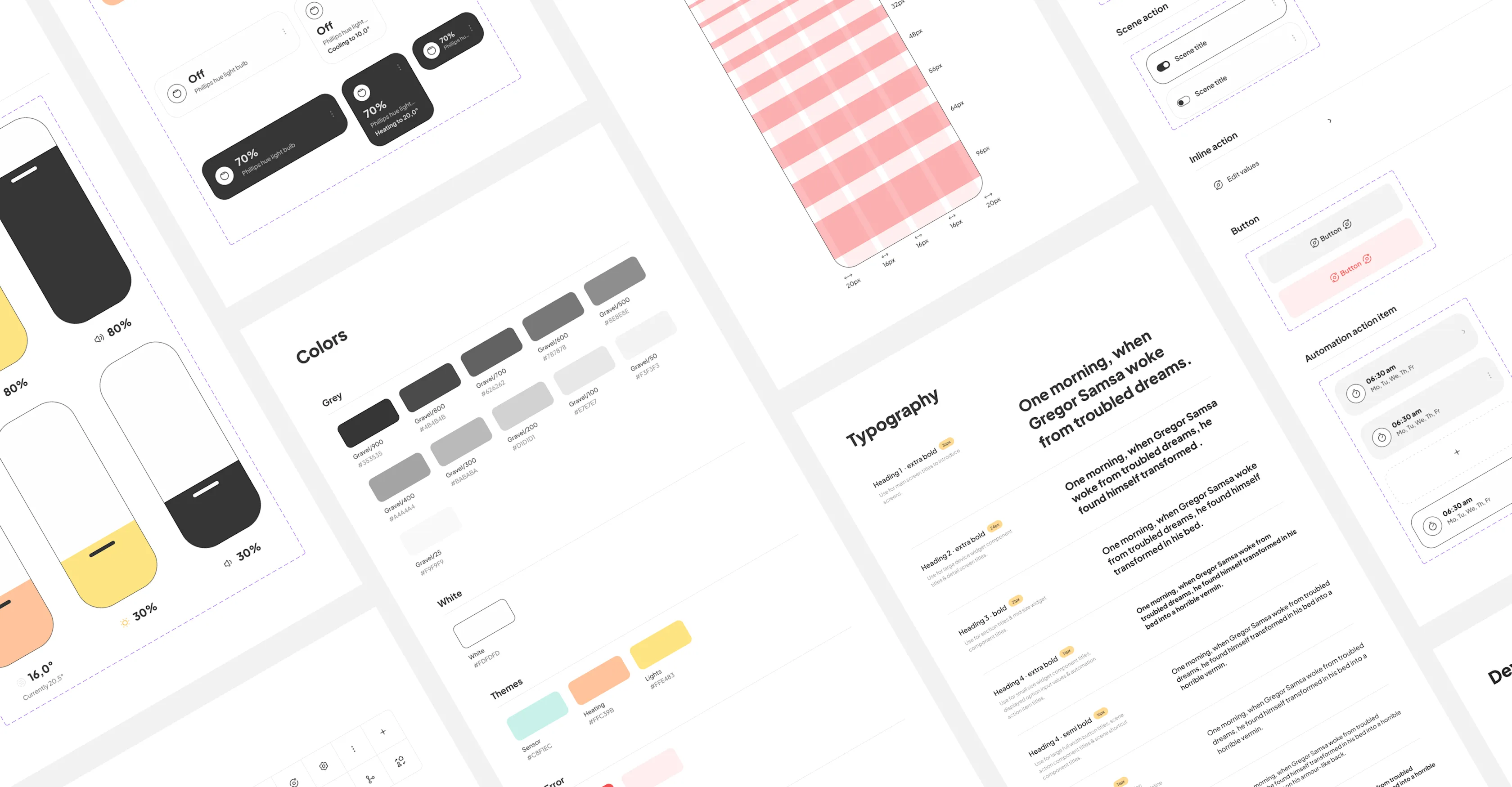
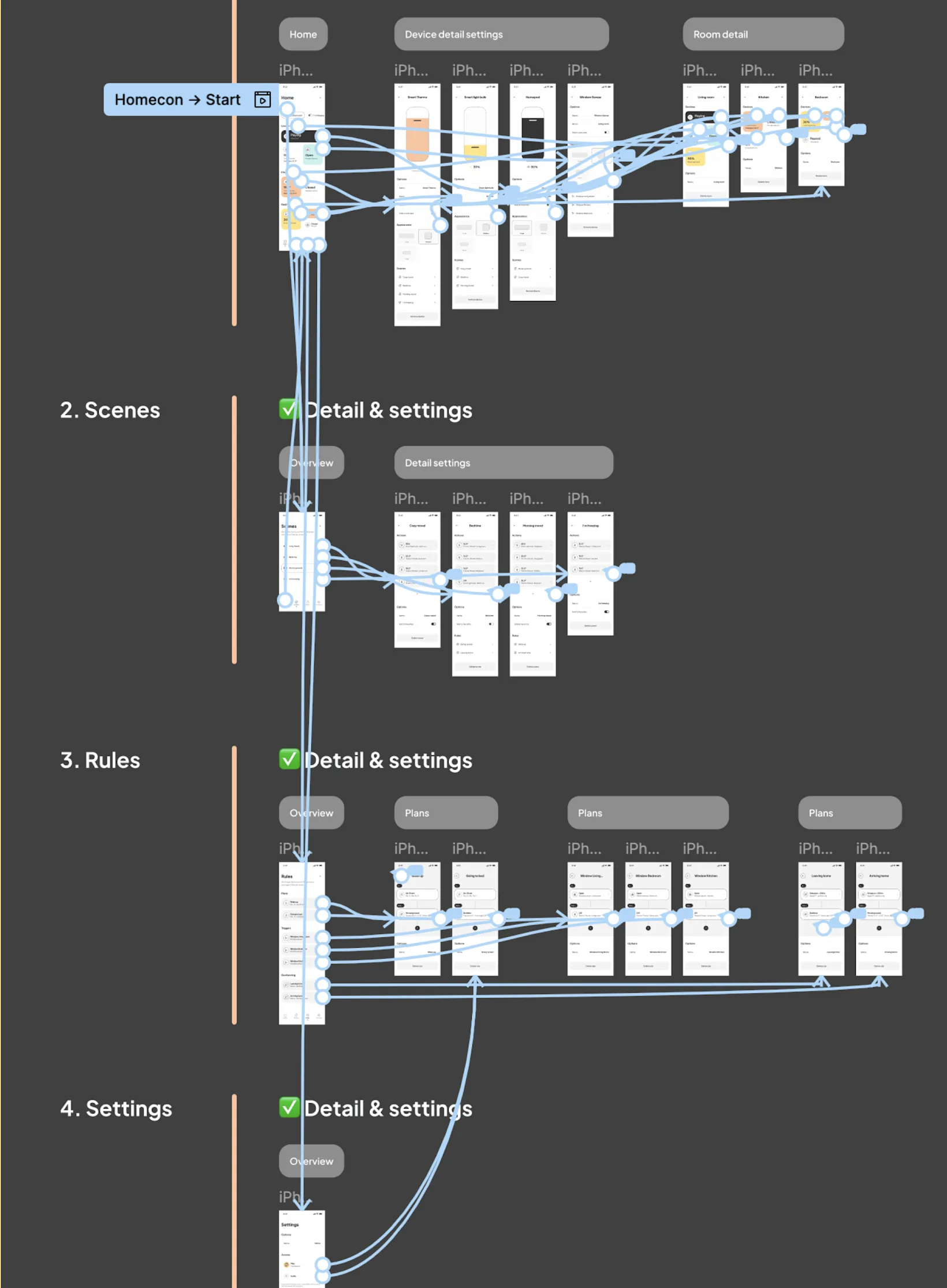
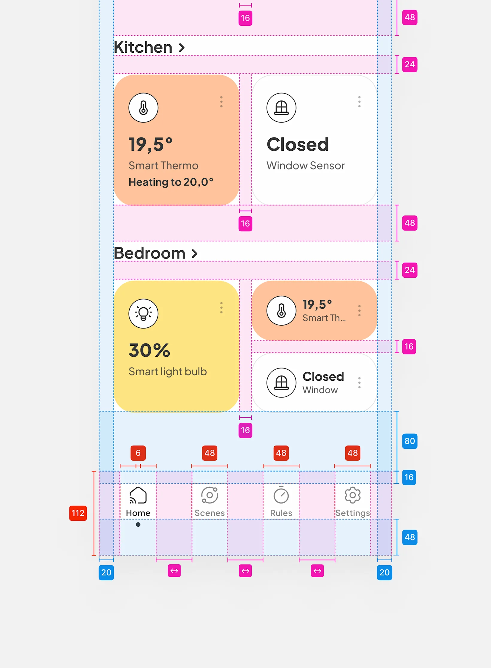
Technical execution prioritized an atomic component-first architecture, architecting a file structure designed for both developer handoff and immediate team entry. As a prototyping glimpse, the Slide Controller was engineered through complex interactive logic and drag triggers to bridge the gap between static design and physical gesture. By standardizing tokenized styles and modular libraries, the final design handling provides a scalable blueprint that ensures technical clarity and collaborative longevity.
Oh Well, Fair Point
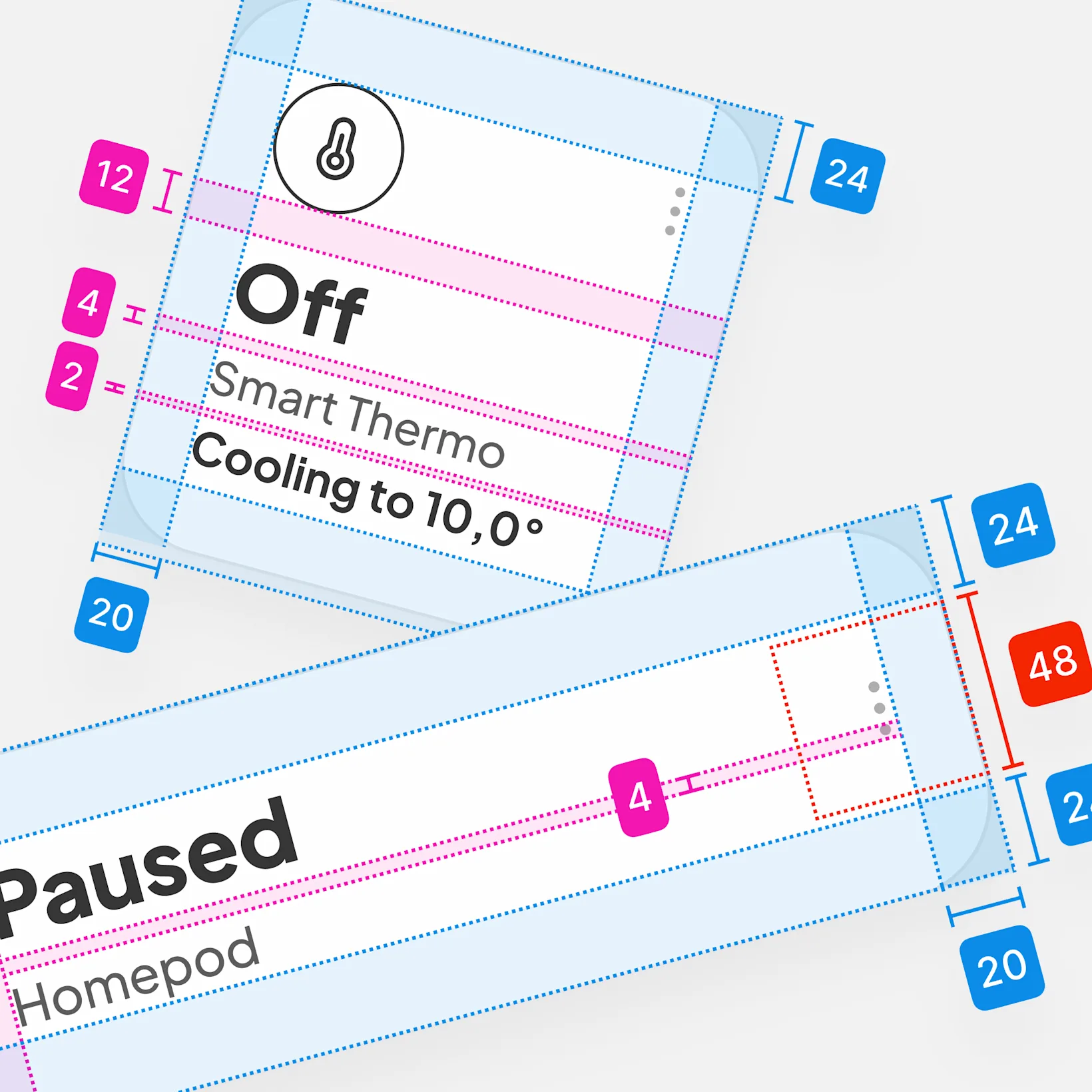
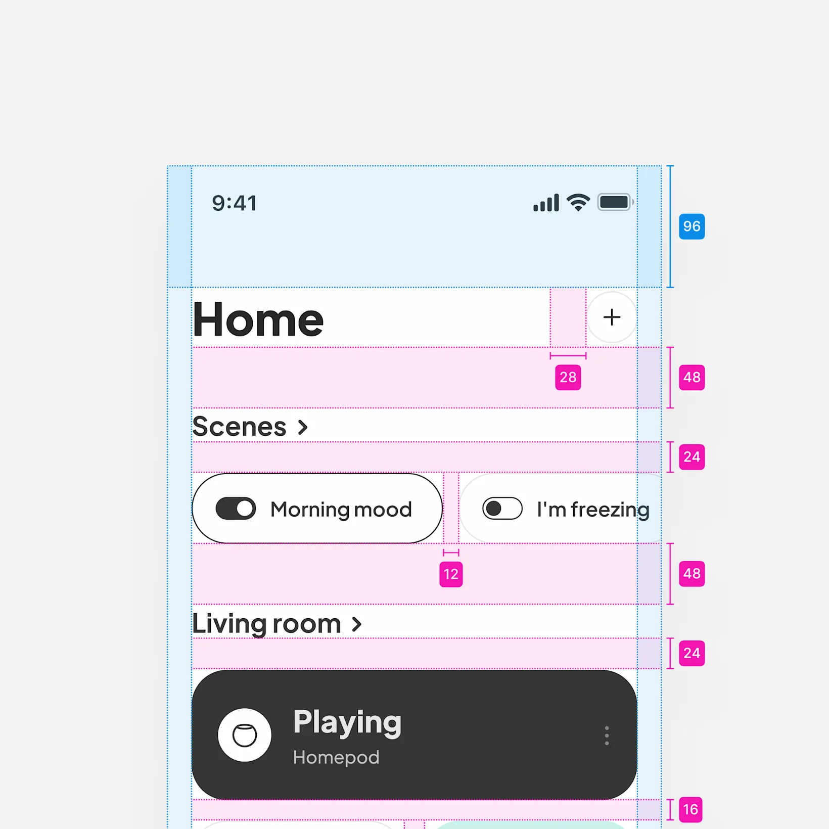
The removal of elevation creates an "affordance void" where interactive cards risk blending into static backgrounds. To solve this, I shifted the cognitive load to high-contrast borders and active-color fills. This ensures "On/Off" states are readable at a glance without the performance overhead of blur effects. It is a trade-off that favors visual speed and accessibility over decorative shadows, requiring a deliberate, functional visual grammar.
Look into the crystal ball
While the project is closed, the conceptual roadmap highlights a shift toward Context-Aware Modules. This product thinking exercise envisions proximity data dynamically re-sorting the dashboard—placing "Living Room" controls at the top only when the user is physically there. The vision is a "Zero-UI" state, where intent is anticipated via time and location, removing manual friction and allowing the home to transform into a truly autonomous, responsive environment.

Are you
a high-fiver?
handcrafted website